BEFORE IT GOES BAD | END TO END MOBILE APP
Empowering users to efficiently manage leftovers and minimize food waste while being economical.
BACKGROUND
The modern lifestyle often leads to the accumulation of leftover ingredients in our kitchens, resulting in significant food waste and hurts the environment. This not only wastes food and harms the environment but also isn't very cost-effective, considering how essential food is in our daily lives.
PROBLEM
Many individuals face the challenge of managing leftover ingredients and often resort to throwing them away, contributing to food waste and environmental degradation. The lack of inspiration and guidance in utilizing these ingredients leads to repetitive and uninspired meals, further adding to the issue.
GOAL
To develop an intuitive and user-friendly mobile app that empowers individuals to efficiently manage leftover ingredients, build a diverse recipe repertoire, and minimize food waste while being economical.
ROLE
UX/UI Designer
DURATION
95+ hours
TOOLS
Figma
Whimsical
Maze

1 | EMPATHIZE — Exploring users needs
OVERVIEW
Research Goals
Research Methodologies
Synthesis Debrief
Pain Points
RESEARCH GOALS
Gain insights into users' experiences, attitudes, and behaviors regarding leftover food management.
Identify pain points in utilizing leftover ingredients.
Explore preferences and expectations regarding a mobile app for managing leftovers.
Investigate common behaviors and practices regarding leftover food management in households.
Determine users' awareness of pantry contents and assess the app's potential to increase awareness.
RESEARCH METHODOLOGIES
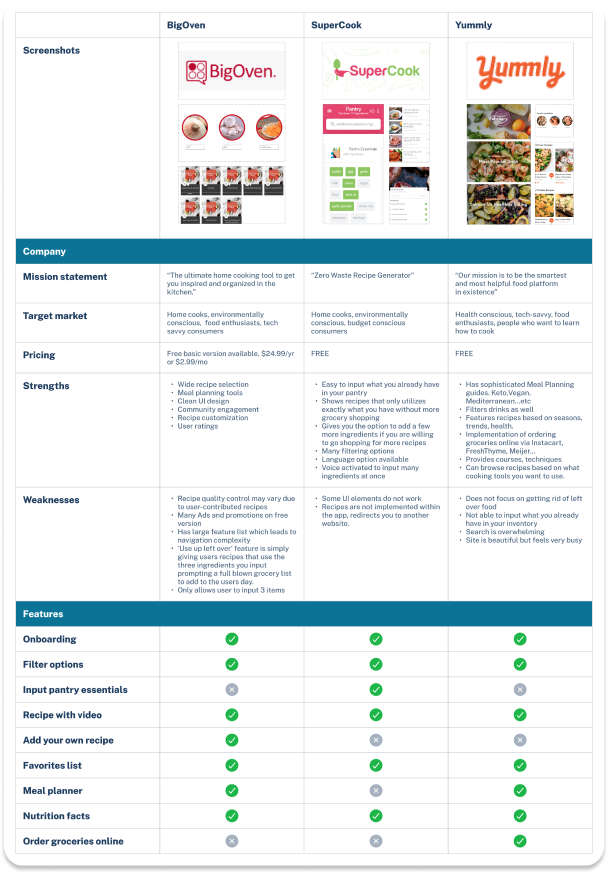
Initial secondary market research was conducted to gain insights into the business, goals, and target audience of Before It Goes Bad and the recipe app industry.
COMPETITIVE ANALYSIS
My competitive research conducted on competitors in the recipe app business was focused on strengths, weaknesses, what services they offer, and where they can improve on. This helped me gauge the current trends and standards of the industry while taking note of usability and pain points of their apps.
Needs that were not currently met:
Limited ingredient options- some apps do not allow users to input specific ingredients which could lead to frustration.
Complexity in recipe search- confusing and busy interfaces, making it difficult for users to find relevant recipes quickly.
Lack of customization- such as dietary restrictions or preferences and a customizable inventory they can use regularly.
A notable absence of features- for inputting personal recipes for documentation and sharing within the app community.
Do not focus on helping users use up ingredients they already have on hand, which can lead to wasted food and frustration.
QUALITATIVE INTERVIEWS
I conducted qualitative interviews with five participants from diverse backgrounds, ranging from individuals living alone to those residing with others. While I didn't specifically target environmentally conscious individuals, all participants had some level of cooking experience, aligning with the core concept of the app as a recipe platform. This intentional approach allowed me to explore potential user demographics beyond the environmentally conscious. Through these interviews, I gained valuable insights into the underlying reasons for unintended food waste, challenges in managing leftover ingredients, and common meal preferences.
Interview Findings
Cooking Habits:
Users often cook extra servings due to perceiving cooking as a chore.
Dietary Preferences:
Dietary preferences vary among users due to factors like health concerns and personal tastes.
Leftover Management:
Users frequently freeze leftover ingredients for simple meal preparations like soups or stir-fries.
Leftover ingredients are common, and users struggle to utilize them effectively.
Some users compost food scraps to manage waste responsibly.
Organizing leftover food by shelf life is a common practice.
Reasons for food waste include forgetfulness, procrastination, uncertainty about recipes, and dislike for grocery shopping.
Cooking Approach:
Users balance between following recipes and improvising in cooking.
Users may not always enjoy improvised meals but consume them to avoid waste.
Users search for recipes online but may lack necessary ingredients.
Interview
5 Interviewees
Age bracket: 25-50
Various pay brackets
Video call
30 min duration
SYNTHESIS DEBRIEF
Analyzing the insights and information from each participant and grouping them into themes using an affinity map enabled me to gain a holistic understanding of their experiences and identify specific human problems that exists.
Affinity Map Themes
Cooking for number of people
Meal planning/Preferences
Leftover management
Satisfaction level with improvised meals
Frequency of having leftover ingredients after cooking
Frequency of letting ingredients expire
Reasons behind why food is left to expire
Last resort methods to use up ingredients
Pain points
Suggestions
2 | DEFINE — Establishing users concerns
Overview
User Personas
Problem Statement
Point of View Statement
How Might We Question
To deepen my understanding of my users' needs and establish a clear focal point for solution development, I created user personas. These personas were developed based on insights gleaned from user interviews conducted as part of the research phase.
USER PERSONAS


PROBLEM STATEMENT
Many individuals struggle to maximize the use of ingredients on hand without the need to purchase additional groceries, leading to food waste and dissatisfaction with meal options.
POV
As someone who hates wasting food and wants to make the most of the ingredients I have on hand without having to buy more groceries to add to it, I need a solution that simplifies the process of finding recipes based on the items available in my fridge and pantry. This will help to reduce food waste, save time and money, and enjoy more varied and satisfying meals at home.
HMW
How might we design a user-friendly app feature that analyzes users' existing pantry and fridge inventory, provides recipes using those ingredients, encouraging them to minimize food waste while enjoying new culinary experiences?
3 | IDEATE — Developing the framework
Overview
Feature Set
Project Goals
Site Map
Task + User Flow
Low-Fidelity Wireframe
UI Design
After research, analysis, and defining the problem, it’s time to put all the data together to design the right solution. To start, I brainstorm ideas on how to approach the design solution through flow charts, site maps, card sorting, wireframes, and UI design.
FEATURE SET
In creating my MoSCoW feature set, I prioritized features by necessity. This approach ensures clear prioritization and effective resource allocation.
'Must-have' features are essential for core functionality and user satisfaction.
'Should-have' features enhance the user experience but aren't critical.
'Could-have' features are nice additions if time and resources allow.
'Won't-have' features are reserved for future roadmapping.
PROJECT GOALS
I made a Venn diagram to visualize my project goals clearly. It helps highlight things to consider and how it will impact users and the business. The diagram shows the connections between different benefits.
Business Goals — increasing user engagement, building brand loyalty, expanding the user base, and generating revenue through partnerships or premium features.
User Goals — emphasize finding creative recipes, reducing food waste, improving cooking skills, accessing personalized recommendations.
Technical Goals — prioritize developing a user-friendly interface, integrating ingredient scanning, and ensuring compatibility across multiple devices.
Central to these goals are features like social sharing and providing a seamless user experience.
TASK + USER FLOWS
Creating a task flow chart allowed me to identify clear pathways that guide users effortlessly toward their goals. Moreover, it aided in determining the essential pages needed to build a thorough prototype. The task flows centered around the core concept of the app, which is to log the user's current inventory and explore recipes based on available ingredients.
Creating a user flow helped me consider various paths users may take. This process prompted me to anticipate both potential and unnecessary paths—making the user flow as seamless as possible.
Key/Legend

User Flow
Task Flow
LOW FIDELITY WIREFRAME
During the low-fidelity wireframing phase, I utilized brainstorming and element rearrangement to swiftly organize the design hierarchy. These blank building blocks allowed for the initial visualization of the app's design and information architecture. It provided a straightforward approach to fine-tuning and repositioning elements before finalizing decisions.
Core Values
Accessible
Approachable
Easy
Friendly
Fun
Light-hearted
Simple
MOOD BOARD
I curated a mood board rooted in my core values: approachability, fun, light-heartedness, friendliness, simplicity, accessibility, and ease. Each element carefully chosen for the mood board embodies these values, guaranteeing that the design captures the essence of a warm, enjoyable, and user-friendly experience.
UI DESIGN
I crafted a brand identity using rounded shapes, fonts, and elements that reflect my core values. These elements served as guiding principles throughout the design process, resulting in a cohesive brand identity that embodies the essence of these values.
LOGO EXPLORATION
Using my mood board as a guide, I explored various logo designs that align closely with my core values, ensuring that each design embodies the essence of these principles. As the app revolves around consuming food ‘Before It Goes Bad,’ my exploration journey began with ideas inspired by time/expiration dates, grocery stores, and household food supplies.

Key Ingredients
4 | PROTOTYPE — Giving life to the design
MAIN PRODUCT FRAMES
Cuisine

Below the recipe on the full recipe page, photos of other users' final outcomes are displayed, along with an option to upload personal photos and rate the recipe. This helps other users make informed decisions when selecting a recipe.
Users can mark ingredients as used and save the recipe directly from this page.


TEXT INPUT
Add Category
Chip Selection
OVERVIEW
High Fidelity Wireframes
Prototyping
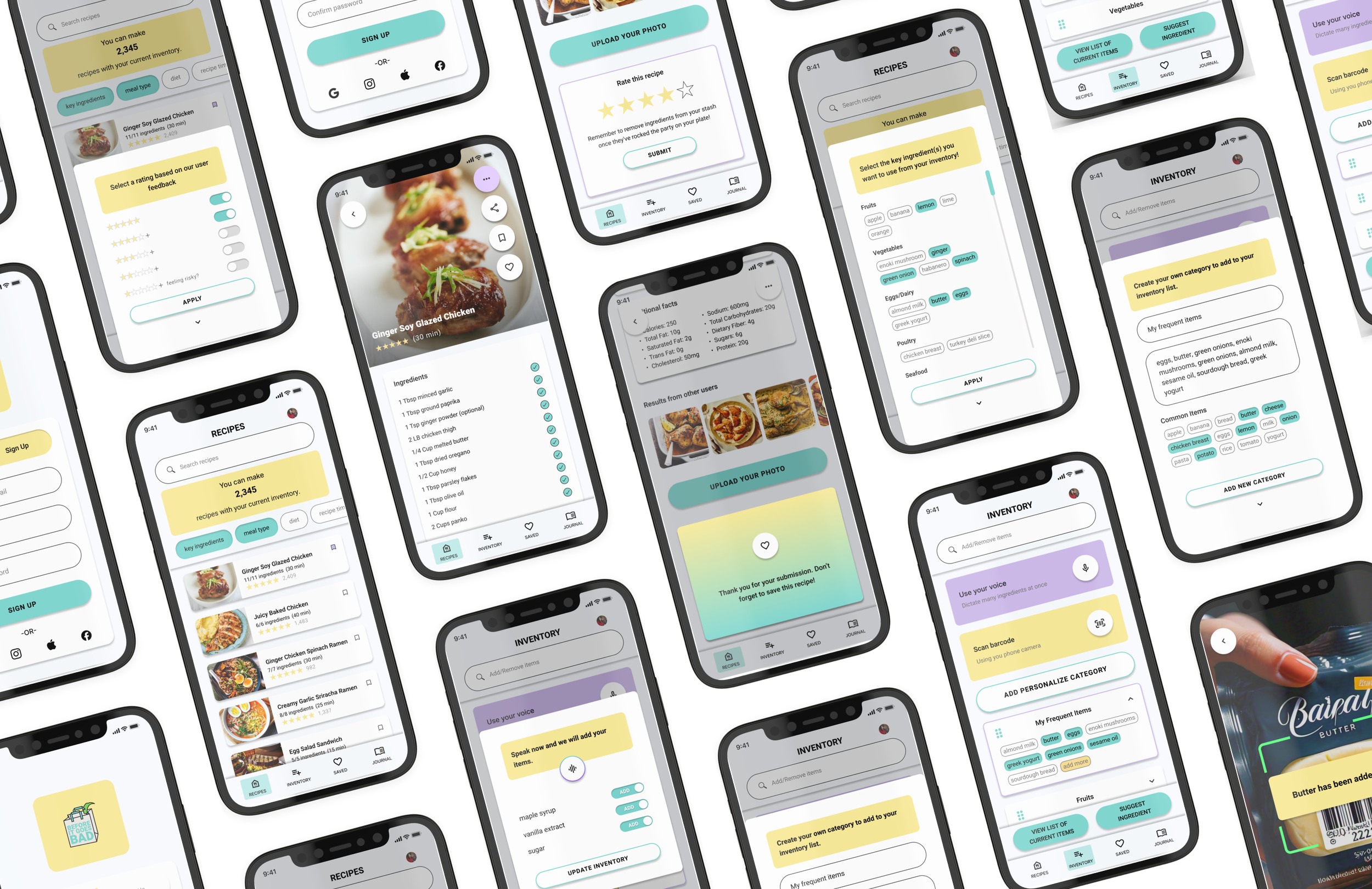
The transition from low-fidelity wireframes to high-fidelity designs incorporates elements from the mood board, such as the color palette, typography, logo, and icons. These high-fidelity frames effectively evoke the desired atmosphere, with a light-themed style that conveys approachability and simplicity. Bright primary colors further enhance the friendly and warm atmosphere.
HIGH FIDELITY WIREFRAMES
Meal Type
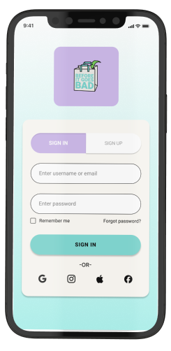
Sign in + Sign up screens are designed to visually remain on the same page for a seamless onboarding experience.
The 'Recipe' page is set as the default home page, allowing users to instantly search for classic recipes or filter results based on their preferences.
The full recipe page will display ratings, user counts, and straightforward recipe information for easy scrolling while cooking. Users can upload their results and provide ratings for engagement.
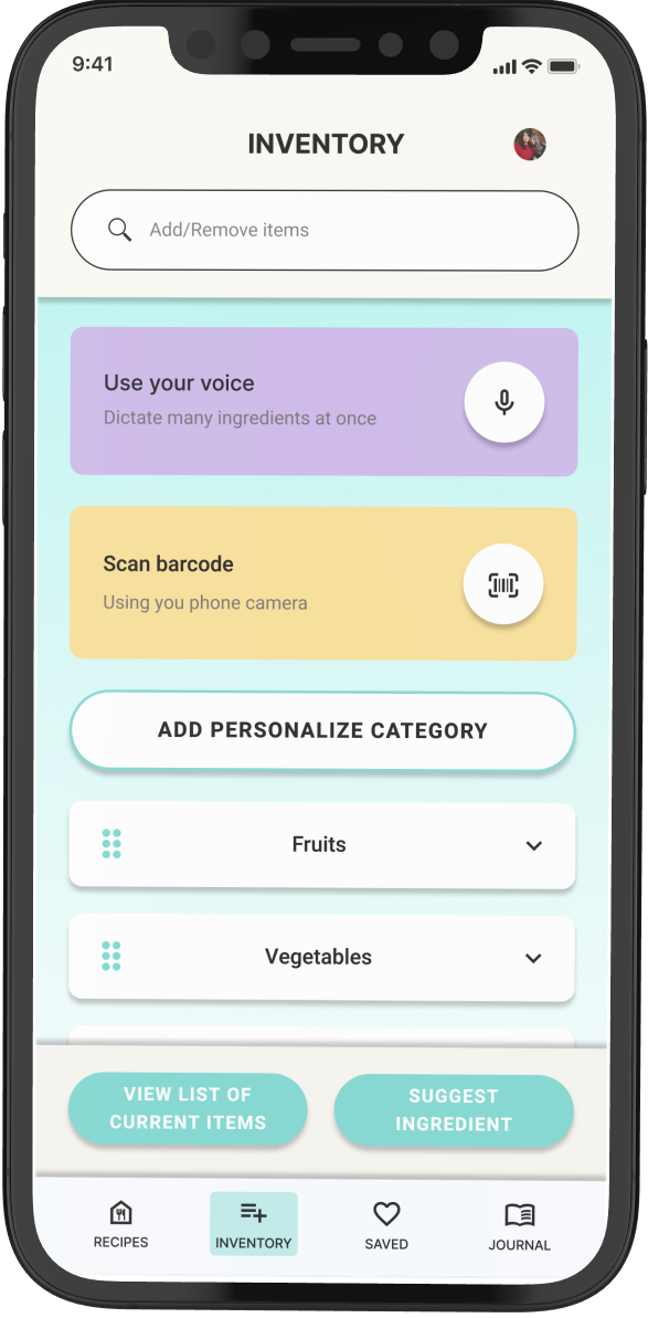
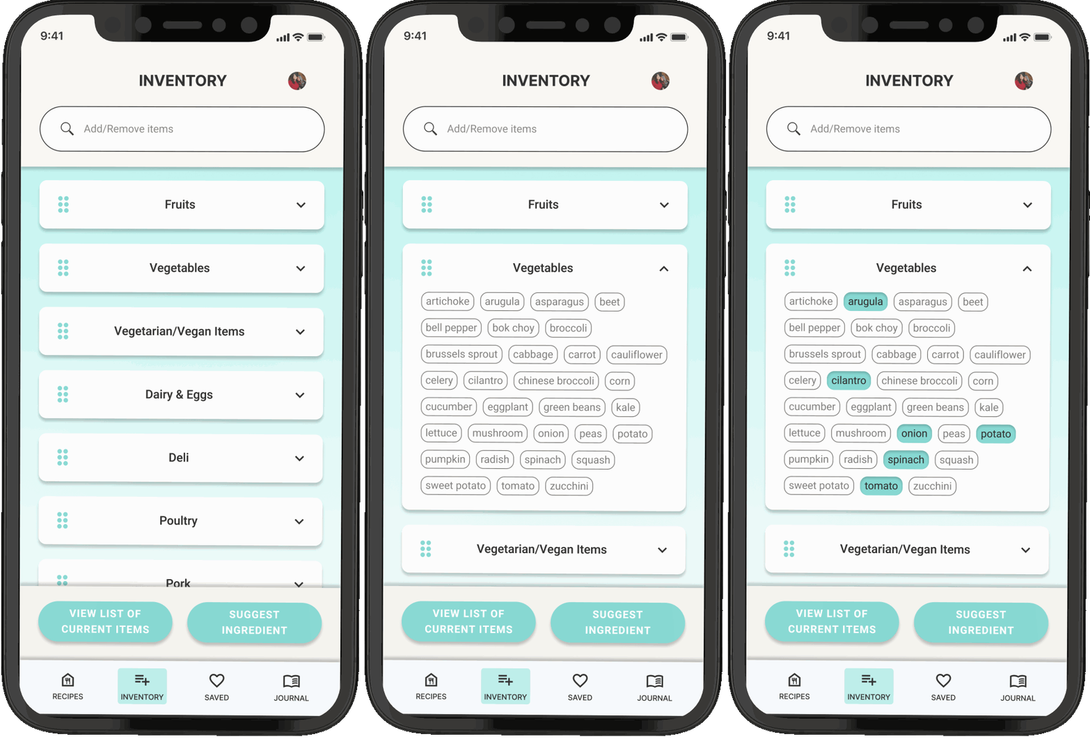
The ‘Inventory’ page is where users will be offered several methods to input their current inventory they have on hand.
Text Input
Voice Input
Barcode Scanner
Accordion Menus with selection chips in each category.
Ability to create a personal menu


Diet
FEATURE OVERLAYS | HOME PAGE
Preferences / Filters


Press + Drag to reorganize. By default, the list is sorted with items that expire soonest at the top.
Cooking Time
A scrollable bar of filters allows users to choose from a wide range of preferences, accommodating diverse needs and selections.
Rating

FEATURE OVERLAYS | FULL RECIPE PAGE
Rating Submission / Remove Used Ingredients / Save Recipe
FEATURE OVERLAYS | INVENTORY PAGE
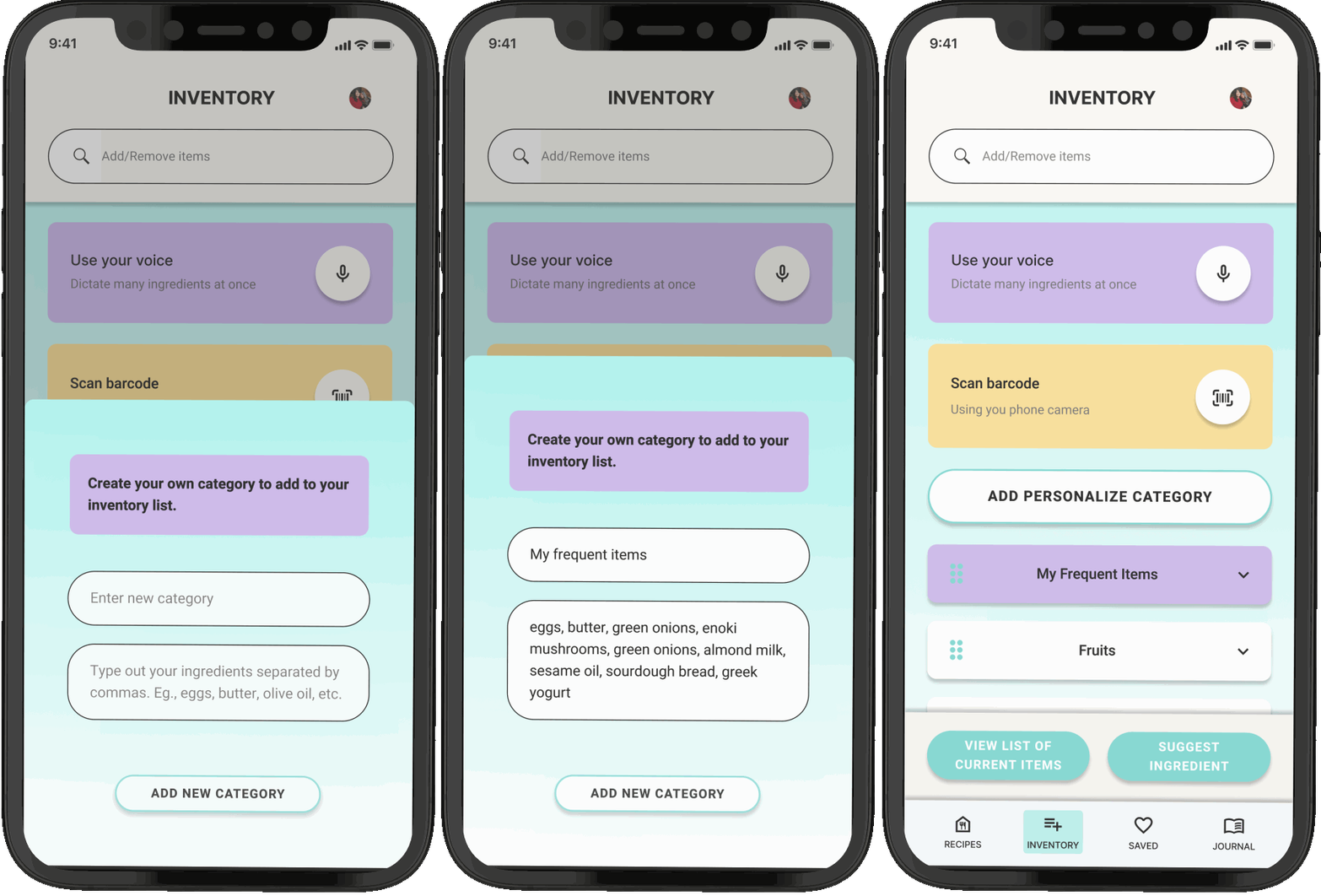
Text Input / Voice Input / Scan Input / Chip Selection / Create Personal Category
Text Input
Voice Input
Scan Input

Chef Level


VOICE INPUT
SCAN INPUT
ADD CATEGORY
CHIP SELECTION
I have incorporated multiple inventory input methods to provide flexibility for different users, accommodating both quick entry of numerous items and the addition of just a few items.
Max Ingredients
Interactive Prototype
PROTOTYPING
After completing the wireframes, I meticulously crafted prototypes to illustrate the product's interactions, ensuring a seamless flow and logical, satisfying animations that enhance the user experience.


5 | TESTING — Ensuring its viability
Overview
Usability Test Results
Test Summary
Priority Revisions
Final Design
During testing, I validate prototypes with real users to gather feedback and insights. Through usability testing and user feedback sessions, I assess design usability and effectiveness, refining based on user input to create impactful solutions.
USABILITY TEST RESULTS
MAZE UNMODERATED TESTING
TASK — Begin by SIGNING UP, then proceed to set your 'key ingredients' and 'meal type' preferences for recipe results. Next, select the 'Ginger Soy Glazed Chicken' recipe and navigate through the page to leave a 5 star rating for the recipe then head to the 'INVENTORY' page.


MODERATED VIDEO TEST
With the same tasks, I conducted a moderated test via video call. This method allowed for a free explorations while capturing the users reactions and thoughts that came up throughout the test.


After onboarding, the user explored the available filter options to search for recipes. Her initial question was whether the 'Key Ingredients' could be edited, before she discovered the 'Inventory' tab. This taught me the importance of considering the order of operations when designing tests.
The full recipe page displays the necessary ingredients for the selected recipe with checkmarks indicating that all ingredients are available in the user's inventory. As she explored, she discovered that some ingredients could be unchecked, but she was unsure of the purpose of this function.
At the end of the page, there's a rating system for users who have tried the recipe to provide feedback. Alongside the star icons is a reminder to remove ingredients that have been used up. She found it useful to be able to check off ingredients from the list above.
The user successfully rates the recipe which triggers the ‘thank you’ overlay that also reminds users to bookmark or save recipe.
Very Difficult
OPINION SCALE
How would you rate the overall usability of the app on a scale of 1 to 10, with 10 being the most usable?

Moderate
Very Easy
Areas for Fine Tuning
List Organization: Users suggested arranging key item preferences in a more digestible format, possibly categorized for easier navigation.
Error Hint Assistance: Users expressed the need for spelling error hints when inputting customized ingredients to prevent mistakes.
Common Item Suggestions: Providing a list of common items to select when creating a personalized category menu could enhance the user experience.
USABILITY TEST SUMMARY
What Worked
Intuitive Onboarding: Users found the initial setup process clear and easy to understand.
Clear Navigation: The app's design was straightforward and made it easy for users to find what they needed.
Comprehensive Options: Users appreciated the wide range of recipe preferences and filters available.
User Satisfaction: Users appreciated the wide range of recipe preferences and filters available.
Effective Elements: The use of icons and the rating system was seen as helpful and intuitive.
ITERATIONS
LIST ORGANIZATION
I organized key ingredients into categories, arranging them based on their lifespan from shortest to longest. Within each category, I alphabetized individual items for easier reference.
BEFORE

AFTER

ERROR HINT ASSISTANCE
I integrated error hints that provide suggestions for correcting spelling errors when they are detected. Users are prompted to correct any spelling mistakes before they can proceed further.
COMMON ITEM SUGGESTIONS
I've added an additional section within the modal where users can select from a list of common items rather than having to manually type them out to expedite this process.

BEFORE


AFTER


FINAL DESIGN


I envision numerous opportunities for partnering with like-minded companies committed to addressing food waste. Implementing discount codes or cross-promotional programs could raise awareness of the issue while providing eco-friendly users with great deals.
FUTURE ROADMAPPING
There are several features that could be added alongside the crowd density heatmap for future roadmapping. Here are some ideas that stood out to me:

To align with the brand's fun and light-hearted personality, I plan to introduce monthly challenges to boost user engagement. These could include cooking contests, best recipe presentation photos, or tracking the number of times a user cooked within the month. Additionally, users will be able to share their results on social media platforms.

I also want to enable the recipe “Journal" button that is at the bottom right of the navigation bar. This feature will serve as a home for users to document and share their personal recipes within the app. Monthly challenges will provide exposure to individuals, encouraging other users to browse and try recipes from each other's journals.
REFLECTION
Working on this project taught me many valuable lessons. The ones that really stood out were:
Size and Scale
I learned the importance of efficient mobile screen design. It's crucial to utilize every pixel effectively and ensure that essential information remains readily viewable. I experimented with Figma's "sticky" features to enhance the scrolling experience. This ensured that recipes and inventory lists remained the focal point within the viewport, improving user navigation.
Information Architecture
Finding an effective organization method for lists and categories presented a challenge. In certain instances, grouping categories and arranging items alphabetically proved most effective for navigating through information seamlessly. Additionally, careful consideration should be given to categorizing items depending on the nature of the project.
Constraints
While exploring different effects in Figma, I found them captivating and visually appealing. Yet, I came to recognize the significance of exercising restraint and upholding simplicity for an ideal user experience. Hence, I consciously opted to reduce the usage of effects, in line with my fundamental values of simplicity and accessibility.

