

SWIFT
Assisting young professionals in effectively managing their relocation amid their demanding schedules.
BACKGROUND
Relocating to a new place entails a wide range of tasks, each with varying degrees of urgency and time commitment. Existing resources typically only focus on specific facets of the moving process, such as packing, moving, budgeting, and home renovations. This takes a toll on many individuals in their daily lives because of the overwhelming tasks and to keep up with.
PROBLEM
Young professionals face numerous challenges when relocating to a new place due to the complex and fragmented nature of the moving process. Despite existing resources that address specific tasks, individuals often struggle with organization and task prioritization. This fragmented approach leaves them feeling overwhelmed and unsure of where to begin, leading to inefficiencies and increased stress.
GOAL
Our objective is to gain insight into the difficulties encountered by young professionals as they prepare for, undergo, and manage the aftermath of a relocation. This understanding allows us to empathize with their needs and gather valuable insights pertaining to various elements, motivations, and strategies for creating a platform that simplifies the planning and coordination involved, ultimately relieving the substantial stress associated with the process of moving.
ROLE
UX/UI Designer
DURATION
110+ hours
TOOLS
Figma
Whimsical
Maze

EMPATHIZE

DEFINE

IDEATE

PROTOTYPE

TEST
1 | EMPATHIZE — Exploring users needs
Overview
Research Goals
Research Methodologies
Synthesis Debrief
Pain Points
RESEARCH GOALS
Determine what pain points and challenges users may experience when relocating.
Understand how people use existing services in their progress and how it’s managed.
Understand the process of prioritizing when the relocating decision is made.
Learn what the pros and cons of existing services are.
RESEARCH METHODOLOGIES
Initial secondary market research was done to better understand the business, goals, and target audience of Swift and the moving industry.
Competitive Analysis
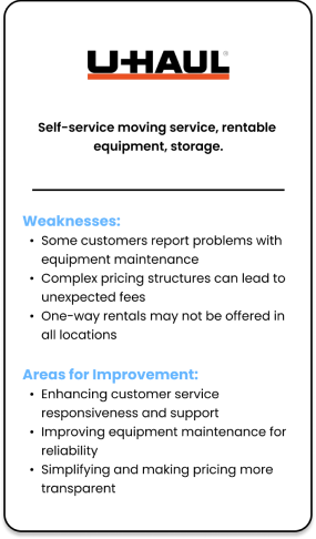
The research conducted on competitors in the moving industries was focused on strengths, weaknesses, what services they offer, where they can improve on, and user feed back. This helped me gauge the current trends and standards of the moving industry while taking note of usability and pain points of their websites and apps. Uhaul was the main moving service across all of my interviewees. It is the most ubiquitous company in the moving industry, however, the users still faced issues. Some of these issues were customer support, pricing transparency, lack of labor of the moving aspect.


Qualitative Interviews
There were 2 in-person and 3 remote interviews conducted during the research phase where participants were asked questions based on their personal experiences on relocating to a new location. This helped me gain valuable real-life insight on reasons behind moving decisions and road blocks before, during, and after the move.
Interview Findings
People move for various reasons, including financial struggles, financial investments, better living conditions, and personal growth.
Most opt for a DIY approach, particularly in the 28-38 age group no matter what pay bracket.
The process involves pre-move preparations, management during the move, and post-move tasks.
Challenges include delays, extra expenses, and unexpected issues.
Difficulty in finding trustworthy sources.
Emotional impact involves uncertainty about support, budget, and being away from loved ones.
Advice for first-time movers: plan ahead, consider professional movers, secure employment, prepare for expenses, communicate effectively with moving partners, plan living space and storage before unloading, and research the new location.

Interview
5 Interviewees
Age bracket: 28-38
Various pay brackets
Video call + in person interview
30-40 min duration
Moving within the same city + cross country
Problem
I noticed many pain points derived from poor timing–some of this which led to unanticipated expenses and delays, unexpected errors in services they paid for, finding trustworthy sources, and some were not able to accurately access the spatial requirements needed for their rental truck or living space.
SYNTHESIS DEBRIEF
Analyzing the insights and information from each participant and grouping them into themes using an affinity map enabled me to gain a holistic understanding of their experiences and identify specific human problems that exists.
Affinity Map Themes
Reasons for moving
Moving with dependents or partners
Support
Moving management/organization
Before
During
After
Resources used
Own resources
Pain points
Budget expectations
Advice for first time movers
Adaptation in new location

2 | DEFINE — Establishing users concerns
Overview
User Personas
How Might We Question
To enhance my comprehension and connection with my users' needs, I crafted a user persona to serve as my focal point during solution ideation. These personas are constructed using data gathered from user interviews conducted during the research phase.
USER PERSONAS


“HOW MIGHT WE”
Following the participant interviews, I directed my efforts towards formulating "How Might We" problem statements. I observed consistent overarching themes and specific issues that piqued my interest for potential solutions.
How might we develop a tool that helps young professionals set real-time reminders and notifications to help them proactively manage both critical and time-sensitive activities while making economical choices throughout their moving journey?
3 | IDEATE — Developing the framework
Task: Booking a Moving Service
Overview
Card Sorting
Site Map
Task Flow
User Flow
Low-Fidelity Wireframe
UI Design
After research, analysis, and defining the problem, it’s time to put all the data together to design the right solution. To start, I brainstorm ideas on how to approach the design solution through flow charts, site maps, card sorting, wireframes, and UI design.
CARD SORTING
Provides insight on how participants organize the given information in their minds.
Useful information to help group data in ways that is easiest or most fluid for users to understand.
36 CARDS were sorted into an average of 6 GROUPS.
Aides in the construction of IA (Information Architecture), user flows, and task flows.
SITE MAP
Leveraging data gathered from card sorting facilitated the creation of a site map.
Each section is dissected according to the data and structured in the most intuitive and logical manner possible.
Utilizing competitor research also accelerated the organization process.


TASK FLOW
Creating this task flow chart enabled me to pinpoint pathways guiding users seamlessly toward their intended objectives. Additionally, it facilitated the identification of necessary pages for developing a comprehensive prototype. The task flows were designed for onboarding, task list creation, and booking moving services.

USER FLOW
Creating a user flow enables me to consider various paths users may take, even those diverging from the intended route. This process allows me to anticipate both potential and unnecessary paths—making the user flow as seamless as possible.

LOW FIDELITY WIREFRAME
Brainstorming and moving elements around during low fidelity wireframe phase was a quick method I used to help arrange the hierarchy in the design.
These blank building blocks provide designers and developers with the initial visualization of the designs.
This offers a simple method for adjusting and relocating elements before making final decisions.
Responsive design of the home page for scaled down versions in tablet and mobile form.


Core Values
Management
Empowerment
Progress
Transparency
Organization
Sophisticated
Mood Board —
SWIFT App’s overall atmosphere suggests quick and efficient movement. It's a concise and memorable name that conveys the app's focus on facilitating smooth transitions during moves or task management.
Logo Design—
With the core values in mind design from initial sketches, digital mock ups, to final logo design.
UI Kit—
A design system was created to provide a centralized and cohesive set of guidelines, components, and assets that maintain consistency across the brand's design.


UI DESIGN
Following research and strategy, the design begins to take shape as I assembled UI elements, encompassing color palettes, typography, and iconography. The SWIFT brand strives to embody a contemporary, crisp, and empowering aesthetic, using sans-serif fonts and a soothing dark mode design.


4 | PROTOTYPE — Giving life to the design
Task: Onboarding + Create a New Task List
Overview
High Fidelity Wireframes
Prototyping
The low-fidelity wireframes transition to high-fidelity counterparts, integrating the mood board's color palette, typography, logo, and icon designs. These high-fidelity frames successfully capture the intended atmosphere. Adopting a dark-themed style exudes professionalism and empowerment, while the soothing primary colors facilitate swift, efficient, and seamless transitions.
HIGH FIDELITY WIREFRAMES


PROTOTYPING
Having finalized my wireframes, I meticulously prototyped the product's interactions, carefully orchestrating the flow and ensuring that animations were both logical and satisfying to the user experience.


5 | TESTING — Ensuring its viability
Overview
Usability Test Plan
Test Summary
Priority Revisions
Key Takeaways

Prominent Item Selection: Enhance the visibility of the collapse button for major item selections, providing clear completion feedback for improved user interaction.

Areas for Fine Tuning
Simplify Dashboard: Streamline the Home/Dashboard page, reducing the amount of text and creating a more user-friendly interface.
Strategic Information Display: Consider presenting less information on the initial view of the dashboard to prevent users from getting overwhelmed. Gradually providing more specific details as users delve into each category.
Optimize Button Placement: Positioning the "Add Task" button at the top of the viewport is recommended, aligning with user expectations.
Enhance Item Selection Elements: Make the collapse button for major item selection more prominent, accompanied by completion feedback to improve user interaction.

KEY TAKEAWAYS
Working on this project has been an invaluable learning experience, providing me with a comprehensive understanding of the UX design process from inception to completion. Throughout the journey, I gained deeper insights into the significance of each phase and how they intricately build upon one another to achieve a cohesive outcome. Reflecting on my contributions, I recognize areas for personal growth, particularly in refining my research methodologies and enhancing my presentation skills. Moving forward, I am eager to apply these key takeaways to future projects, striving for continuous improvement and excellence in my UX design practice.
The research objective is to assess the usability, accessibility, and effectiveness of the app as users navigate and accomplish tasks. This involves analyzing user experience, identifying issues, and collecting feedback to enhance platform usability and customization using insights from users.
USABILITY TEST PLAN
Participant Data
7 Participants
Age range: 25-40
Participant occupations:
Police officer
Stay-at-home-mom
Concrete tester
Computer programmer
Video game 3D environment designer
Photographer
Residential home designer
Remote testing using Maze
Unmoderated
USABILITY TEST SUMMARY
Task Flows
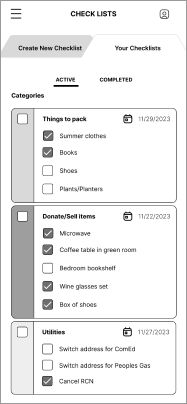
Creating new task list category.
Booking a moving service.
Success Metrics
Users are able to complete the tasks without confusion.
Users are able to complete the tasks in a timely manner.
Users are satisfied with the experience on given tasks.
Users are able to identify errors, if any, and provide insight.
Users are able to identify UI elements and what they are meant to do.
Follow Up Questions
What was your overall impression of this product?
On a scale from 1-5, how easy was it to perform the given tasks? 1 being difficult and 5 being easy
What, if anything, do you think can be added or taken away to improve the product?
Was there anything that was confusing during your flow in the process?
What Worked
Effective Color Scheme: The thoughtfully chosen color scheme, along with strategic placement on specific elements, contributed to user focus and satisfaction.
User-Friendly Buttons and Icons: The comfortable sizes and easy-to-tap design of buttons and icons were positively received, enhancing the overall usability.
Comprehensive Options: All anticipated options were readily available, ensuring a seamless user experience.
Intuitive Navigation: The app's easy navigation was a key success factor.
Booking Completion Page Satisfaction: Users expressed satisfaction with the booking completion info page, highlighting a positive end-user interaction.
PRIORITY PROVISIONS
Dashboard Simplification: Streamlining the dashboard for a more user-friendly experience is crucial to avoid overwhelming users with information.
Optimized Information Gradation: Start with a simplified dashboard, gradually increasing specificity within each category to enhance user engagement.

Users will immediately notice daily reminders and buttons that guide them to the services relevant to the tasks for that day.
Strategic Task/Search Bar Placement: Consider relocating task/search bars to the top of the viewport, aligning with user expectations for easier accessibility.
1 | EMPATHIZE — Exploring users needs
Overview
Research Goals
Research Methodologies
Synthesis Debrief
Pain Points
RESEARCH GOALS
Determine what pain points and challenges users may experience when relocating.
Understand how people use existing services in their progress and how it’s managed.
Understand the process of prioritizing when the relocating decision is made.
Learn what the pros and cons of existing services are.
RESEARCH METHODOLOGIES
Initial secondary market research was done to better understand the business, goals, and target audience of Swift and the moving industry.
Competitive Analysis
The research conducted on competitors in the moving industries was focused on strengths, weaknesses, what services they offer, where they can improve on, and user feed back. This helped me gauge the current trends and standards of the moving industry while taking note of usability and pain points of their websites and apps. Uhaul was the main moving service across all of my interviewees. It is the most ubiquitous company in the moving industry, however, the users still faced issues. Some of these issues were customer support, pricing transparency, lack of labor of the moving aspect.
Qualitative Interviews
There were 2 in-person and 3 remote interviews conducted during the research phase where participants were asked questions based on their personal experiences on relocating to a new location. This helped me gain valuable real-life insight on reasons behind moving decisions and road blocks before, during, and after the move.
Interview Findings
People move for various reasons, including financial struggles, financial investments, better living conditions, and personal growth.
Most opt for a DIY approach, particularly in the 28-38 age group no matter what pay bracket.
The process involves pre-move preparations, management during the move, and post-move tasks.
Challenges include delays, extra expenses, and unexpected issues.
Difficulty in finding trustworthy sources.
Emotional impact involves uncertainty about support, budget, and being away from loved ones.
Advice for first-time movers: plan ahead, consider professional movers, secure employment, prepare for expenses, communicate effectively with moving partners, plan living space and storage before unloading, and research the new location.
Interview
5 Interviewees
Age bracket: 28-38
Various pay brackets
Video call + in person interview
30-40 min duration
Moving within the same city + cross country
Problem
I noticed many pain points derived from poor timing–some of this which led to unanticipated expenses and delays, unexpected errors in services they paid for, finding trustworthy sources, and some were not able to accurately access the spatial requirements needed for their rental truck or living space.
SYNTHESIS DEBRIEF
Analyzing the insights and information from each participant and grouping them into themes using an affinity map enabled me to gain a holistic understanding of their experiences and identify specific human problems that exists.
Affinity Map Themes
Reasons for moving
Moving with dependents or partners
Support
Moving management/organization
Before
During
After
Resources used
Own resources
Pain points
Budget expectations
Advice for first time movers
Adaptation in new location
2 | DEFINE — Establishing users concerns
Overview
User Personas
How Might We Question
To enhance my comprehension and connection with my users' needs, I crafted a user persona to serve as my focal point during solution ideation. These personas are constructed using data gathered from user interviews conducted during the research phase.
USER PERSONAS
“HOW MIGHT WE”
Following the participant interviews, I directed my efforts towards formulating "How Might We" problem statements. I observed consistent overarching themes and specific issues that piqued my interest for potential solutions.
How might we develop a tool that helps young professionals set real-time reminders and notifications to help them proactively manage both critical and time-sensitive activities while making economical choices throughout their moving journey?
3 | IDEATE — Developing the framework
Task: Booking a Moving Service
Overview
Card Sorting
Site Map
Task Flow
User Flow
Low-Fidelity Wireframe
UI Design
After research, analysis, and defining the problem, it’s time to put all the data together to design the right solution. To start, I brainstorm ideas on how to approach the design solution through flow charts, site maps, card sorting, wireframes, and UI design.
CARD SORTING
Provides insight on how participants organize the given information in their minds.
Useful information to help group data in ways that is easiest or most fluid for users to understand.
36 CARDS were sorted into an average of 6 GROUPS.
Aides in the construction of IA (Information Architecture), user flows, and task flows.
SITE MAP
Leveraging data gathered from card sorting facilitated the creation of a site map.
Each section is dissected according to the data and structured in the most intuitive and logical manner possible.
Utilizing competitor research also accelerated the organization process.
TASK FLOW
Creating this task flow chart enabled me to pinpoint pathways guiding users seamlessly toward their intended objectives. Additionally, it facilitated the identification of necessary pages for developing a comprehensive prototype. The task flows were designed for onboarding, task list creation, and booking moving services.
USER FLOW
Creating a user flow enables me to consider various paths users may take, even those diverging from the intended route. This process allows me to anticipate both potential and unnecessary paths—making the user flow as seamless as possible.
LOW FIDELITY WIREFRAME
Brainstorming and moving elements around during low fidelity wireframe phase was a quick method I used to help arrange the hierarchy in the design.
These blank building blocks provide designers and developers with the initial visualization of the designs.
This offers a simple method for adjusting and relocating elements before making final decisions.
Responsive design of the home page for scaled down versions in tablet and mobile form.
Core Values
Management
Empowerment
Progress
Transparency
Organization
Sophisticated
Mood Board —
SWIFT App’s overall atmosphere suggests quick and efficient movement. It's a concise and memorable name that conveys the app's focus on facilitating smooth transitions during moves or task management.
Logo Design—
With the core values in mind design from initial sketches, digital mock ups, to final logo design.
UI Kit—
A design system was created to provide a centralized and cohesive set of guidelines, components, and assets that maintain consistency across the brand's design.
UI DESIGN
Following research and strategy, the design begins to take shape as I assembled UI elements, encompassing color palettes, typography, and iconography. The SWIFT brand strives to embody a contemporary, crisp, and empowering aesthetic, using sans-serif fonts and a soothing dark mode design.
4 | PROTOTYPE — Giving life to the design
Task: Onboarding + Create a New Task List
Overview
High Fidelity Wireframes
Prototyping
The low-fidelity wireframes transition to high-fidelity counterparts, integrating the mood board's color palette, typography, logo, and icon designs. These high-fidelity frames successfully capture the intended atmosphere. Adopting a dark-themed style exudes professionalism and empowerment, while the soothing primary colors facilitate swift, efficient, and seamless transitions.
HIGH FIDELITY WIREFRAMES
PROTOTYPING
Having finalized my wireframes, I meticulously prototyped the product's interactions, carefully orchestrating the flow and ensuring that animations were both logical and satisfying to the user experience.
5 | TESTING — Ensuring its viability
Overview
Usability Test Plan
Test Summary
Priority Revisions
Key Takeaways
Prominent Item Selection: Enhance the visibility of the collapse button for major item selections, providing clear completion feedback for improved user interaction.
Areas for Fine Tuning
Simplify Dashboard: Streamline the Home/Dashboard page, reducing the amount of text and creating a more user-friendly interface.
Strategic Information Display: Consider presenting less information on the initial view of the dashboard to prevent users from getting overwhelmed. Gradually providing more specific details as users delve into each category.
Optimize Button Placement: Positioning the "Add Task" button at the top of the viewport is recommended, aligning with user expectations.
Enhance Item Selection Elements: Make the collapse button for major item selection more prominent, accompanied by completion feedback to improve user interaction.
KEY TAKEAWAYS
Working on this project has been an invaluable learning experience, providing me with a comprehensive understanding of the UX design process from inception to completion. Throughout the journey, I gained deeper insights into the significance of each phase and how they intricately build upon one another to achieve a cohesive outcome. Reflecting on my contributions, I recognize areas for personal growth, particularly in refining my research methodologies and enhancing my presentation skills. Moving forward, I am eager to apply these key takeaways to future projects, striving for continuous improvement and excellence in my UX design practice.
The research objective is to assess the usability, accessibility, and effectiveness of the app as users navigate and accomplish tasks. This involves analyzing user experience, identifying issues, and collecting feedback to enhance platform usability and customization using insights from users.
USABILITY TEST PLAN
Participant Data
7 Participants
Age range: 25-40
Participant occupations:
Police officer
Stay-at-home-mom
Concrete tester
Computer programmer
Video game 3D environment designer
Photographer
Residential home designer
Remote testing using Maze
Unmoderated
USABILITY TEST SUMMARY
Task Flows
Creating new task list category.
Booking a moving service.
Success Metrics
Users are able to complete the tasks without confusion.
Users are able to complete the tasks in a timely manner.
Users are satisfied with the experience on given tasks.
Users are able to identify errors, if any, and provide insight.
Users are able to identify UI elements and what they are meant to do.
Follow Up Questions
What was your overall impression of this product?
On a scale from 1-5, how easy was it to perform the given tasks? 1 being difficult and 5 being easy
What, if anything, do you think can be added or taken away to improve the product?
Was there anything that was confusing during your flow in the process?
What Worked
Effective Color Scheme: The thoughtfully chosen color scheme, along with strategic placement on specific elements, contributed to user focus and satisfaction.
User-Friendly Buttons and Icons: The comfortable sizes and easy-to-tap design of buttons and icons were positively received, enhancing the overall usability.
Comprehensive Options: All anticipated options were readily available, ensuring a seamless user experience.
Intuitive Navigation: The app's easy navigation was a key success factor.
Booking Completion Page Satisfaction: Users expressed satisfaction with the booking completion info page, highlighting a positive end-user interaction.
PRIORITY PROVISIONS
Dashboard Simplification: Streamlining the dashboard for a more user-friendly experience is crucial to avoid overwhelming users with information.
Optimized Information Gradation: Start with a simplified dashboard, gradually increasing specificity within each category to enhance user engagement.
Users will immediately notice daily reminders and buttons that guide them to the services relevant to the tasks for that day.
Strategic Task/Search Bar Placement: Consider relocating task/search bars to the top of the viewport, aligning with user expectations for easier accessibility.