


GOOGLE MAPS | ADDING A NEW FEATURE
Adding a new feature to an existing app.
BACKGROUND
Over the years, Google Maps has continued to evolve and improve, adding new features and functionalities to enhance the user experience. Today, Google Maps is not only used for navigation but also for discovering local businesses, exploring attractions, and sharing location information with others. It has become an essential tool for millions of people worldwide, helping them navigate the world around them with ease and confidence.
PROBLEM
Google Maps offers live business information, like operating hours and wait times, drawing from its extensive database and real-time updates. However, its availability depends on businesses updating their info on Google My Business. Thus, live data accuracy varies by location and business engagement, potentially limiting its usefulness in less active areas or where data coverage is sparse.
GOAL
To develop and integrate real-time crowd density indicators into Google Maps, enhancing user decision-making by providing heat maps indicating crowd levels outside of businesses and streets.
ROLE
UX/UI Designer
DURATION
85+ hours
TOOLS
Figma
Whimsical
Maze

1 | EMPATHIZE | Exploring users needs
OVERVIEW
Research Goals
Research Methodologies
Synthesis Debrief
Pain Points
RESEARCH GOALS
Investigate user interactions with Google Maps to comprehend preferences and behaviors.
Determine the significance of real-time crowd density information in user decision-making processes.
Assess user trust levels in data from Google's business database, provided by business owners.
Explore motivations driving user preferences for non-busy environments over busy ones.
Utilize gathered insights to refine and optimize the added feature for improved usability and user satisfaction.
RESEARCH METHODOLOGIES
Conducted initial comparative and competitive secondary market research to gain insights into what competitors offer.
Conducted user interviews to gather firsthand accounts of how individuals utilize the service and its significance in their work lives, which may include contextual interviews as needed.
COMPETITIVE ANALYSIS
My competitive research conducted on competitors in the navigational app business was focused on strengths, weaknesses, and what services they offer. This helped me gauge the current trends and standards of the industry while taking note of usability and pain points of their apps.

QUALITATIVE INTERVIEWS
My interview results indicates that real-time data is commonly utilized by users. Some users may peruse this information and make subconscious decisions based on the provided data.
Displaying additional real-time crowd density information could prove beneficial in several ways, such as assisting users in assessing potential parking situations, locating events, avoiding crowds, and mentally preparing for the level of busyness in a particular area. This feature could contribute to a more seamless and enjoyable user experience by empowering users to make informed choices about their activities and destinations, ultimately enhancing their overall satisfaction with the app.
Interview
5 Interviewees
Age bracket: 34-45
Various occupations and pay brackets
3 person interviews/2 video calls
30-45 min duration
Interview Findings
Individuals in the age bracket of 34-45 mainly drive
Reasons for commute are mainly for work, errands, and going out to eat
Commuting to extra curricular activities is very seldom (Note: my participants do not have kids)
Most people uses Google Maps as their navigation app whether they know directions or not.
Main feature used by users:
GPS Navigation
Real Time Traffic Status
Find alternate routes to avoid traffic
Explore Businesses
‘The 'Popular Times' feature is primarily used to determine when to steer clear of specific businesses or areas because:
Means parking will be tough due to high population
Business has long waiting list
Some people just don't like crowded places
An indicator that hastily prepared food may not be of good quality
Unable to fulfill a short lunch break from work
Interesting Insights/Comments
“I use the GPS navigation when I don't know where I’m gonna and when I know where I’m going.”
“I look at the ‘Popular time’ feature and sometimes go anyway despite how busy and crowded it is. It’s just good to know and mentally prepare for it.”
“Usually if there’s traffic, I’m not leaving the house until it is over.”
“There was one time the GPS kept showing me the wrong way no matter how many times I tried to re-route it to my destination. I personally think Google didn’t like that I left a bad review I left a couple of days prior that day. It never happened before till then.”
SYNTHESIS DEBRIEF
Analyzing the insights and information from each participant and grouping them into themes using an affinity map enabled me to gain a holistic understanding of their experiences and identify specific human problems that exists.
Affinity Map Themes
Navigation app of choice
Mode of transportation
Frequency of app usage
Utilized features
Most valued features
Importance of real-time popular business times/traffic
Problems faced with the app being used

2 | DEFINE — Establishing users concerns
OVERVIEW
User Personas
Problem Statement
Point of View Statement
How Might We Question
To deepen my understanding of my users' needs and establish a clear focal point for solution development, I created user personas. These personas were developed based on insights gleaned from user interviews conducted as part of the research phase.
USER PERSONAS


PROBLEM STATEMENT
Google Maps users often depend on live traffic updates to navigate efficiently and check business popularity before visiting. However, they lack crowd density data outside of businesses and roads. This missing information hinders users' ability to make informed decisions about where to go, potentially leading to unexpected encounters with crowds and less-than-ideal travel experiences.
POV
As a frequent user of Google Maps, I often find myself unsure about the crowd density around my destination, which can lead to unexpected crowds and discomfort during my outings.
HMW
How might we provide Google Maps users with real-time crowd density information to help them anticipate and avoid crowded areas while planning their routes?
3 | IDEATE — Developing the framework
OVERVIEW
Feature Roadmap
Task Flow + User Flow
Project Goals
Low-Fidelity Wireframes
Mid-Fidelity Wireframes
After research, analysis, and defining the problem, it’s time to put all the data together to design the right solution. To start, I brainstorm ideas on how to approach the design solution through flow charts, wireframes, and UI design.
FEATURE ROADMAP
I created a feature roadmap chart to clearly outline the essential components needed for the feature to function, as well as additional elements that could be included and those that could be implemented later.

TASK + USER FLOW
Creating a task flow chart allowed me to identify clear pathways that guide users effortlessly toward their goals. Moreover, it aided in determining the essential pages needed to build a thorough prototype. The task flows centered around the core concept of the app, which is to log the user's current inventory and explore recipes based on available ingredients.
Creating a user flow helped me consider various paths users may take. This process prompted me to anticipate both potential and unnecessary paths—making the user flow as seamless as possible.

All features were implemented into my design except for the 'Surprising and Delightful' features, which are reserved for future road mapping.
PROJECT GOALS
I made a Venn diagram to visualize my project goals clearly. It helps highlight how the new feature for Google Maps will impact users and the business. The diagram shows the connections between different benefits. It helped me focus on key areas like user engagement, satisfaction, and safety. This visual tool ensures that my project addresses essential needs and objectives. It also makes it easier to communicate my ideas to stakeholders and team members.

LOW-FIDELITY WIREFRAMES
To quickly develop my concept, I sketched wireframes to visualize it frame by frame. This process helped me outline all the necessary frames I initially thought were needed for the feature to function.

MID-FIDELITY WIREFRAMES
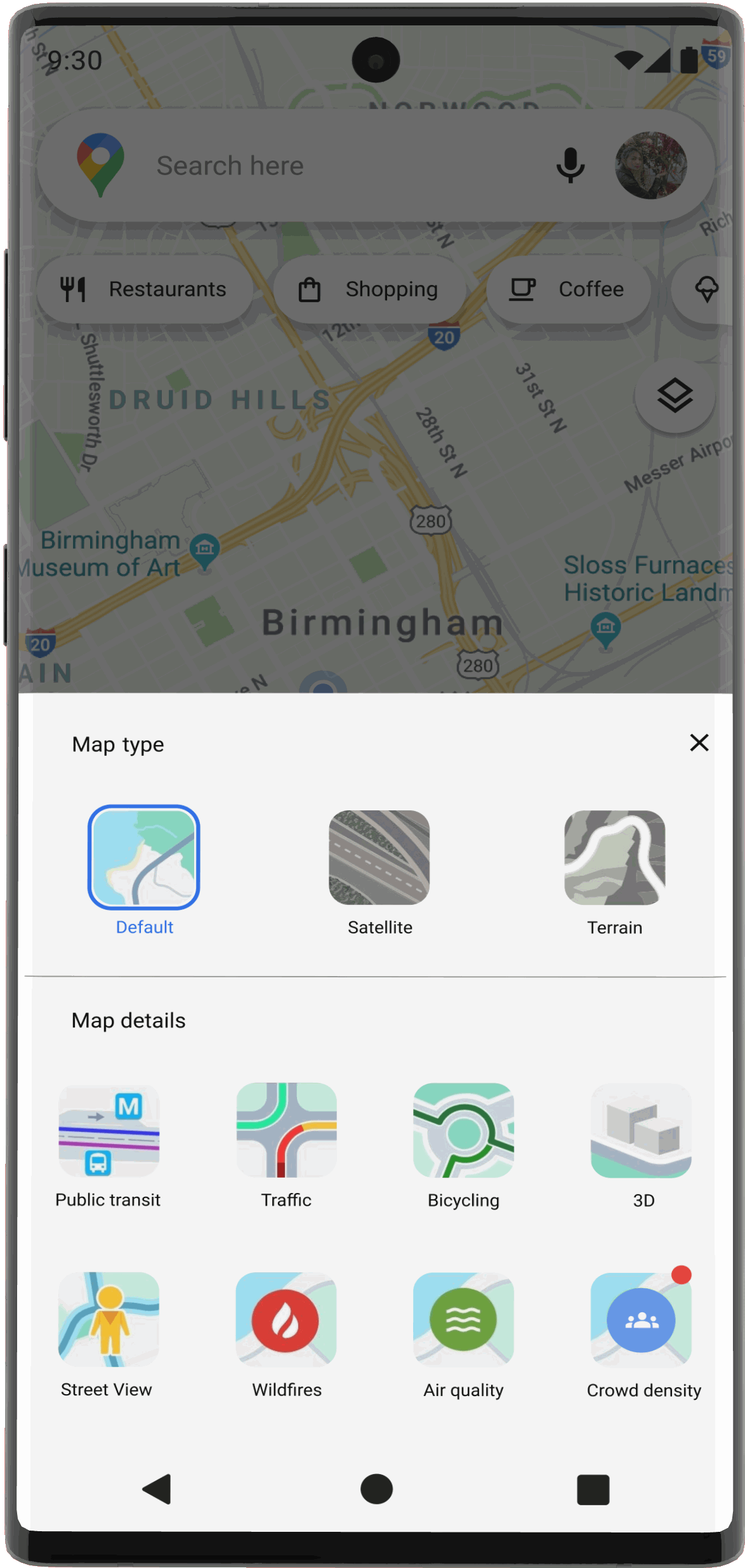
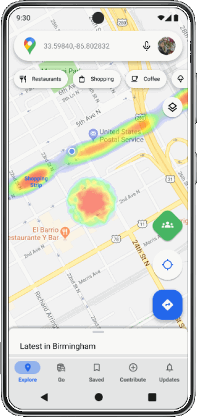
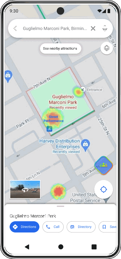
Once I had a clearer understanding of the context for each frame, I developed them into mid-fidelity wireframes using the Google Maps UI Kit. The additional UI elements I created were thoughtfully designed to align with the existing Google Maps interface.

When users enable the crowd density feature and return to the map, heatmaps will appear. Additionally, a new feature icon will be available to toggle the heatmap on and off.

If a heatmap is unlabeled, users can press and hold on the area to input data, contributing information for other users.


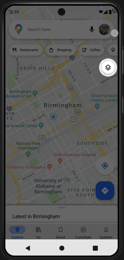
New feature icon viewed in ‘Map Details’ menu along with existing map overlay features.

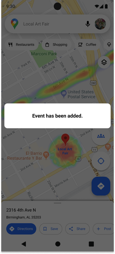
Users are able to post photos of the event taking place to contribute information for other users.
4 | PROTOTYPE — Giving life to the design
OVERVIEW
High-Fidelity Wireframes
Prototyping
The transition from mid-fidelity wireframes to high-fidelity designs was primarily guided by user testing feedback. This feedback indicated no need for changes to the visual design but highlighted the importance of refining interactions and prototyping.
HIGH FIDELITY WIREFRAMES


The new feature icon is highlighted in Google's green to ensure visibility.
A feature introduction screen has been added to directly inform current users about the new feature and the accompanying icon that was overlooked in the mid-fidelity wireframes.
Here is an example of an unlabeled heatmap event where users may press + hold for the location menu to appear and input data.
Once an event category has been selected, a form field will appear for specific labeling of the event.
The ‘add event’ confirmation lightbox has been relocated to the bottom of the viewport to maintain consistency with Google's design kit.
PROTOTYPING
After completing the wireframes, I meticulously crafted prototypes to illustrate the product's interactions, ensuring a seamless and logical flow, satisfying animations that enhance the user experience.
Interactive Prototype
5 | TESTING — Ensuring its viability
OVERVIEW
Usability Test Results
Test Summary
Priority Revisions
During testing, I validate prototypes with real users to gather feedback and insights. Through usability testing and user feedback sessions, I assess design usability and effectiveness, refining based on user input to create impactful solutions.
TASK 1
Open Google Maps and turn on the 'crowd density' feature then exit the menu.


TASK 2
Zoom in on the center of the crowd to reveal crowd event info, if there is no data input on the crowd, add an event.

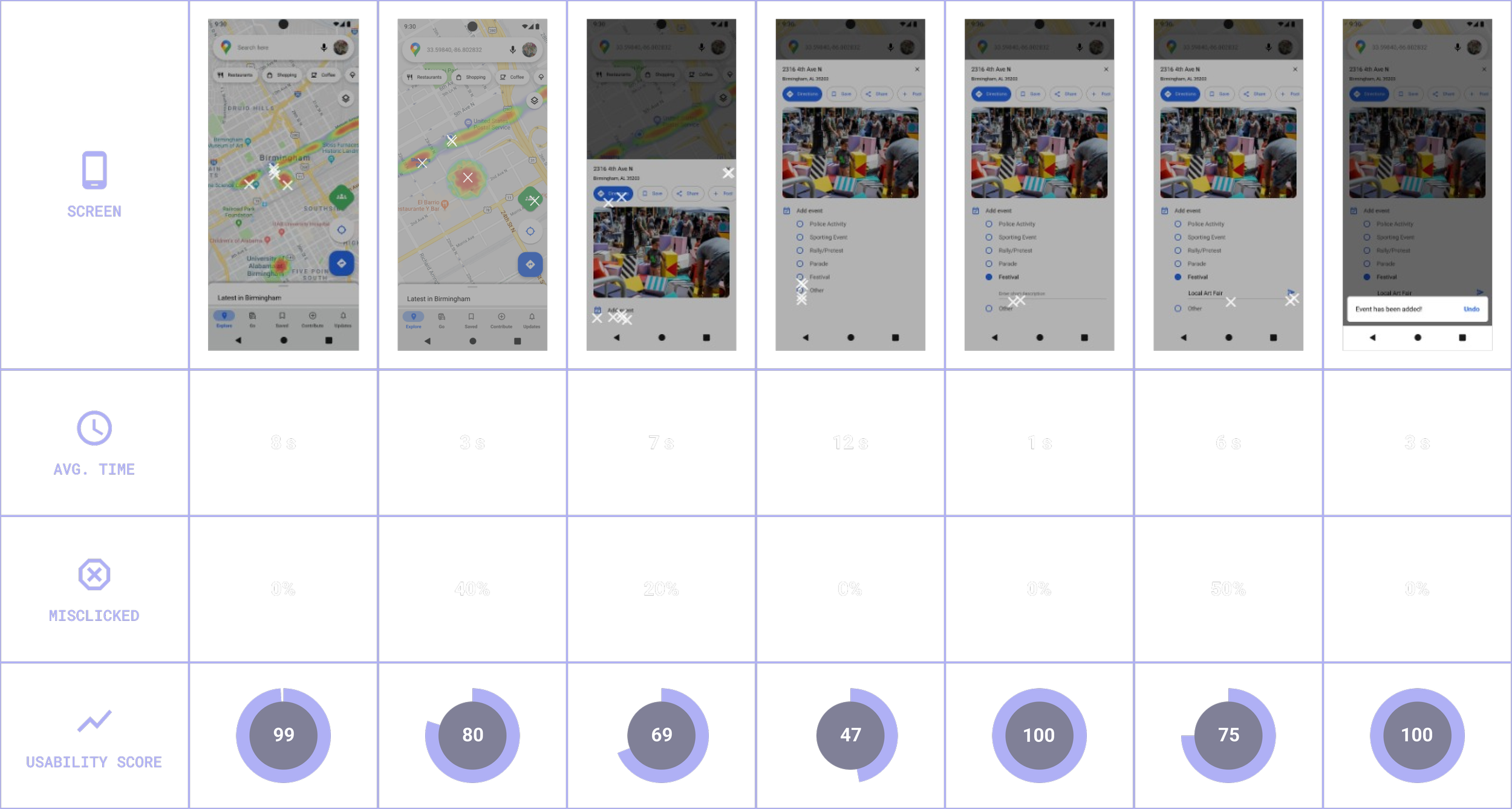
TASK 3
Enter a new address, then toggle off the crowd density feature from the map screen.


USABILITY TEST RESULTS
Areas for Fine Tuning
Icon Recognition: The crowd density icon was expected to somewhat resemble the heatmap in colors.
Feature Introduction: Introduction to the new heatmap icon overlay was easily overlooked. When the ‘crowd density feature was turned on’, users did not notice a new button appeared on the map overlay.
Information Architecture: One user suggested reordering the ‘add event’ options, placing “police activity” and “rallies/protests” toward the bottom of the lists. This varies in every city but the list should be ordered mindfully.
USABILITY TEST SUMMARY
What Worked
Effective Design:
Placement of featured items was where they were expected.
The colors and font sizes are legible similar to the current Google Maps mobile app.
Intuitive Navigation: Crowd density interpretation on the map was intuitive.
User Satisfaction: Users completed given tasks under 60 seconds, indicating ease of use.
BEFORE
ITERATIONS


Icon Recognition
My initial design aimed to align closely with the Google Maps UI Kit, but during testing, it went unnoticed. Instead, my iteration veered towards deviating from the UI Kit by incorporating additional colors reminiscent of the heat map overlay feature.
AFTER

Feature Introduction
I rearranged the introduction modal layout to ensure a more linear flow from top to bottom, with the icon strategically placed to be highlighted as the focal point.
BEFORE
AFTER

A simple animation will play for a short time when the crowd density feature is enabled, drawing attention to the accompanying toggle icon.
Information Architecture
The event list was carefully reorganized to place positive activities at the top and more serious events towards the bottom.


Traffic reroutes currently consider traffic congestion, but it would be beneficial to also reroute around crowded areas where large events are happening.
FUTURE ROADMAPPING
There are several features that could be added alongside the crowd density heatmap for future roadmapping. Here are some ideas that stood out to me:
In this mode, users could discover lesser-known, charming locations with low crowd density nearby, encouraging exploration of unique spots off the beaten path.
An additional option could allow users to find specific events happening in the area they are searching, based on the listed events provided in the event list.
REFLECTION
Working on this project taught me many valuable lessons. The ones that really stood out were:
Information Architecture
Organizing the event list was challenging. Alphabetical arrangement often works best, but in this case, with six diverse events, I chose to list the more positive ones at the top. I realized that the ideal order can vary based on user preferences and location, and can be personalized accordingly.
Design Constraints
Adding a feature to an existing app requires maintaining consistency with its UI kit. While designing additional icons for the feature, I noticed users were overlooking the new elements. I learned that sometimes it's necessary to balance consistency with innovation, ensuring the design remains unified while also making new elements stand out.
Test Writing
While my testers completed 100% of the tasks on the prototype, there were numerous misclicks. Analysis of these clicks revealed that users were exploring every button visible on the screen, which affected the test results by increasing the time duration and misclick rate. It's crucial to remind testers that it is a prototype test, not all elements are active, and they should focus on the provided tasks.