TAIPEI HOSTEL | RESPONSIVE WEB DESIGN
Empowering users to efficiently manage leftovers and minimize food waste while being economical.
BACKGROUND
Taipei Hostel has been a popular spot in Taiwan since it opened in 1974, back when tourism was limited due to martial law. Now, it's known worldwide, attracting many guests to its central location in downtown Taipei. It's close to landmarks and the subway (MRT), making it easy to get around. The hostel isn't just budget-friendly—it's also friendly, with staff and guests always willing to help. People love it for its clean rooms, cozy vibe, and great value. Additionally, the hostel boasts a loyal base of returning customers, a testament to its enduring appeal and exceptional hospitality.
PROBLEM
While the Taipei Hostel website provides essential information for travelers, there are opportunities for improvement to enhance the overall user experience. Additionally, including more critical details could better assist users in making informed decisions when browsing accommodations.
GOAL
To revamp the Taipei Hostel website to enhance accessibility, visualization, and overall user experience. By focusing on these aspects, visitors will be able to navigate the site seamlessly and access information with greater clarity.
ROLE
UX/UI Designer
DURATION
88+ hours
TOOLS
Figma
Whimsical
Maze

1 | EMPATHIZE — Exploring users needs
OVERVIEW
Research Goals
Research Methodologies
Synthesis Debrief
Pain Points
RESEARCH GOALS
Gain insights into travelers' priorities and preferences when selecting accommodation options.
Understand the decision-making process of travelers when browsing for accommodations.
Identify common challenges faced by travelers during their search for lodging.
Determine the essential features and amenities and details that come with it that travelers prioritize.
Provide a comprehensive understanding of what matters most to travelers when choosing places to stay during their travels.
RESEARCH METHODOLOGIES
Comparative and competitive research to see what competitors offer, what their strengths and weaknesses are, and reviews
User interviews to understand human thought processing when shopping for a place to stay, what information they seek most, and what issues they encounter.
COMPETITIVE ANALYSIS
Comparing Taipei Hostel’s competitors in the hostel business involved analyzing their strengths, weaknesses, services offered, and areas for improvement. This assessment helped me understand current industry trends and standards, as well as identify usability and pain points in their websites.
Needs that were not currently met:
Unable to view available booking dates.
Must book through human contact through email, no online self booking.
Pricing was only available at a monthly rate.
Website has poor accessibility in some areas.
Layout of content is inconsistent from page to page.
QUALITATIVE INTERVIEWS
I conducted qualitative interviews with five participants from diverse backgrounds, including solo travelers, group travelers, and those traveling with partners. Each participant had unique perspectives on what is most important to them when traveling. For some, the primary focus was experiencing culture shock, while others prioritized food and libations, shopping, or nature adventures. It was fascinating to discover what aspects were important to them when they shopped for accommodation at their destinations.
Interview Findings
Reviews: Incorporating reviews is key for gathering immediate feedback and building trust.
Transparency: Displaying cleaning fees and extra charges upfront, prior to booking, transparency is very important.
Available Information:
Users prefer quick access to information and dislike having to submit questions with uncertain response times.
Visibility of booking availability dates is important for user planning.
Including a map featuring public transit options is highly beneficial for user convenience and planning.
Flexible Options: Offering flexible booking options, including day-to-day rates, accommodates diverse user preferences.
Upfront Pricing: Instant access to pricing is crucial for users comparing options; high ratings or recommendations may mitigate this.
Quality Photos: High-quality, clear, and expandable images of available spaces are essential for user confidence.
Safety: Addressing safety measures and concerns upfront attracts confidence in the business.
Information Architecture: Consistency in site layout and clear information architecture is very important to users, it prevents user frustration and increases engagement.
Suggestions: Offering suggestions for activities adds value to the business.
Highlighted Quotes
“If it's there isn’t information I can get right away and who knows how fast the response time will be. It only gives you a price by month, not many people are able to stay for a month. If I'm looking into actually staying at a place, I'm comparing prices, if I don't see the price and availability right away, I'm knocking it off my list.”
‘If I’m looking into hostels, I'd want to know if it's a trusted site. Seeing reviews or having a trusted source tied to the website, like TripAdvisor or some kind of social account where people know you're real with human interaction and not the same pictures you see on the website.”
“The layout of the web page is important. I like the big picture and how everything flows together, such as the theme, color theme, message. Websites should follow the standardization of a menu bar, header, and searching capabilities. For example, the 3 horizontal line icon that symbolizes menu should be available and easily located. The structure and organization of how each page is sorted is important for me.”
SYNTHESIS DEBRIEF
Analyzing the insights and information from each participant and grouping them into themes using an affinity map enabled me to gain a holistic understanding of their experiences and identify specific human problems that exists.
Affinity Map Themes
Accommodations
Spending
Challenges
Must-Haves
Factors
Process
Website Elements - Must-Haves
Additional Services
2 | DEFINE — Establishing users concerns
Overview
User Personas
Problem Statement
Point of View Statement
How Might We Question
To deepen my understanding of my users' needs and establish a clear focal point for solution development, I created user personas. These personas were developed based on insights gleaned from user interviews conducted as part of the research phase.
USER PERSONAS


PROBLEM STATEMENT
The current hostel website lacks transparency, accessibility, and trustworthiness, hindering potential guests' ability to make informed booking decisions and reducing the website's competitiveness in the market.
POV
As a traveler shopping around for accommodation, I need to find the information I need in a timely manner and trust the business so I can confidently make a booking decision.
HMW
How might we redesign the hostel website to improve transparency, accessibility, and trustworthiness, thereby enabling potential guests to make informed booking decisions and strengthening the website's competitiveness in the market?
3 | IDEATE — Developing the framework
Overview
Feature Set
Project Goals
User Flows
Low-Fidelity Wireframe
UI Design
After research, analysis, and defining the problem, it’s time to put all the data together to design the right solution. To start, I brainstorm ideas on how to approach the design solution through flow charts, site maps, card sorting, wireframes, and UI design.
FEATURE SET
In creating my MoSCoW feature set, I prioritized features by necessity. This approach ensures clear prioritization and effective resource allocation.
'Must-have' features are essential for core functionality and user satisfaction.
'Should-have' features enhance the user experience that adds value in the business.
'Could-have' features are nice additions if time and resources allow.
'Won't-have' features are reserved for future roadmapping if the business is willing to accommodate these features.
PROJECT GOALS
I made a Venn diagram to visualize my project goals clearly. It helps highlight things to consider and how it will impact users and the business. The diagram shows the connections between different benefits.
Business Goals — building trust in the users from reviews and linking trusted sources, offering transparency and enabling online booking services.
User Goals — provide quick access to information, both necessary and extra information to help users make informed decisions, clear and high quality photos.
Technical Goals — implement integration with trusted review platforms, online booking system which allows users to also view availability of rooms, maintain consistency of site IA to facilitate a seamless user experience.
USER FLOWS
Creating a user flow allowed me to identify clear pathways that guide users effortlessly toward their goals. Moreover, it aided in determining the essential pages needed to build a thorough prototype. The task flows centered around building users trust in a business and creating a platform where users can easily explore options and ultimately book a stay.
Key/Legend
Exploring Home Page — Find Reviews and Photos

Booking A Room
LOW FIDELITY WIREFRAME
During the low-fidelity wireframing phase, I used brainstorming and element rearrangement to quickly organize the design hierarchy. I focused on areas of the site that proved to be most important to users shopping for accommodation when traveling, based on my interviews. These blank building blocks allowed for the initial visualization of the app's design and information architecture, providing a straightforward approach to fine-tuning and repositioning elements before finalizing decisions.
HOME PAGE
Desktop
Mobile
Users wished they were able to access more photos from this section
Users wished they were able to access more photos from this section.
Users found the descriptions too lengthy. They suggested keeping them brief and leaving the button linked for further information.
Some users brought up not liking payment information displayed before selecting dates.
Some users liked the amenities icons, but others were unsure of their meanings.
Users found that the display of 'reviews made most sense at the very bottom of the page.
Users wanted to see business information in a FAQs format.
ACCOMMODATION PAGE
Desktop
Mobile
4 | PROTOTYPE — Giving life to the design
HOME PAGE
Desktop


Users preferred not to encounter payment information until after viewing available dates and confirming their booking.
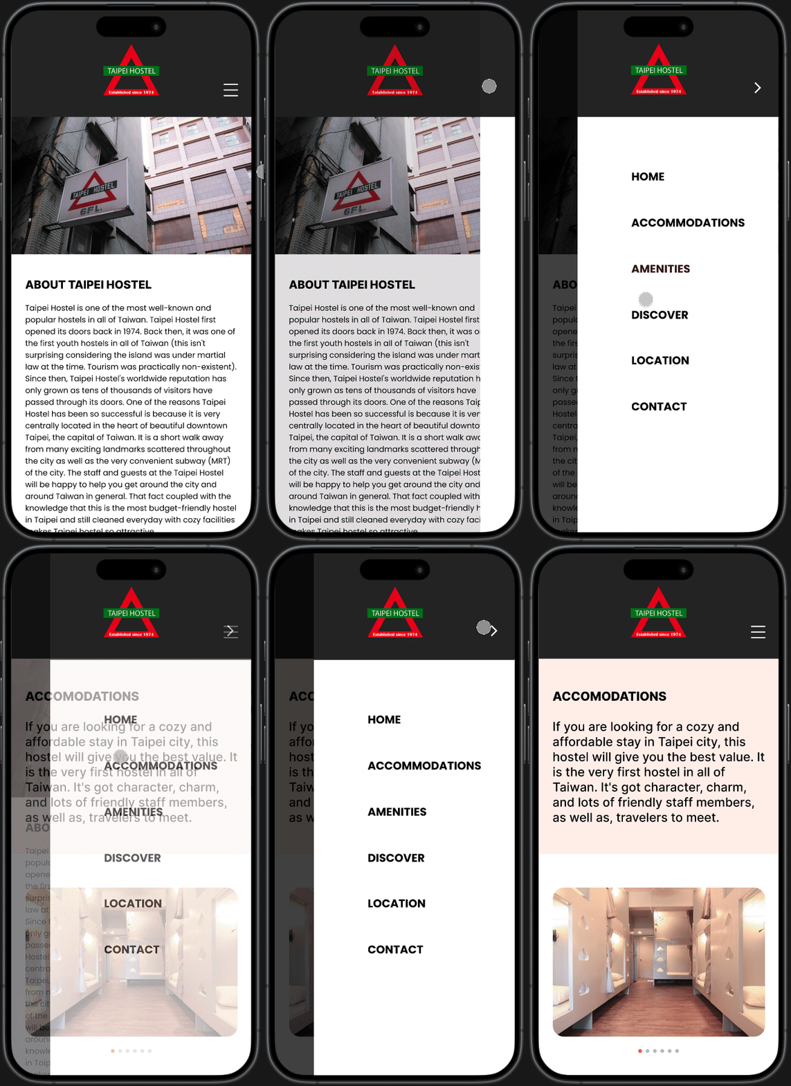
I organized the business information and hostel rules into a FAQ format on the desktop version, while on the mobile version, this information is accessible through the hamburger menu.


OVERVIEW
High Fidelity Wireframes
Prototyping
Mobile
After receiving user feedback, I made several impactful iterations. I applied the existing color theme to my high-fidelity design, ensuring that it remained true to the business's original style. The brand continues to stand out as a welcoming, humble, and budget-friendly business.
HIGH FIDELITY WIREFRAMES
ACCOMMODATIONS PAGE
Mobile

I condensed the hostel description from two paragraphs into one, making it a quicker read for users to grasp the business's history and character.
The category descriptions in the overview section are shortened, prompting users to click a button to learn more.
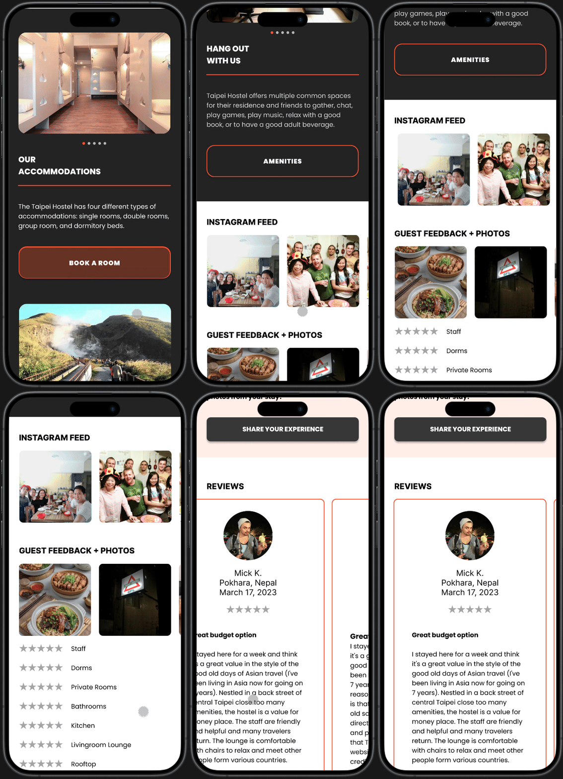
Customer-contributed photos and reviews will expand accordion-style on the desktop, as users are more likely to scroll with a mouse. On the mobile version, it will be presented as a horizontal scroll gallery.
The amenities icons alone were too ambiguous, so I added a hover over effect to display its meaning on desktop.


Desktop
A carousel gallery is added to provide users with more information within this section, ensuring they stay engaged and avoid clicking away to another page before viewing the rest of the content.
Mobile Interactive Prototype
PROTOTYPING
After completing the wireframes, I meticulously crafted prototypes to illustrate the product's interactions, ensuring a seamless flow and logical, satisfying animations that enhance the user experience.
Desktop Interactive Prototype
5 | TESTING — Ensuring its viability
Overview
Usability Test Results
Test Summary
Priority Revisions
Final Design
During testing, I validate prototypes with real users to gather feedback and insights. Through usability testing and user feedback sessions, I assess design usability and effectiveness, refining based on user input to create impactful solutions.
USABILITY TEST RESULTS
MODERATED MAZE TEST
TASK — Discover more about our business by exploring the "About Us" page. Navigate to access social media photos and reviews. The objective of this task is to captivate users, instilling trust in the business while infusing it with distinctive character and personality.

Two out of five users reported that they didn’t realize the gallery could be swiped. They are accustomed to swiping on mobile devices but not on desktops.
Users easily located social media posts from past customers and discovered they could expand photos to view the posters' comments.
Users quickly realized that the gallery and reviews sections were expandable in an accordion format, which met their expectations and confirmed the feature's prominence.

Three out of five users expressed satisfaction with the rating system, appreciating its breakdown into categories that addressed specific factors important to them in a hostel.
Some users expected each review to be expandable for more details but quickly realized that the full review is displayed within the original box.


MULTIPLE CHOICE
Considering the information you've gathered from the website, what are your impressions of this business?

UNMODERATED MAZE TEST
TASK —Discover how to explore the accommodations offered by the business and book a room.


Very Difficult
OPINION SCALE
How easy was it to navigate through this website?

Moderate
Very Easy
Areas for Fine Tuning
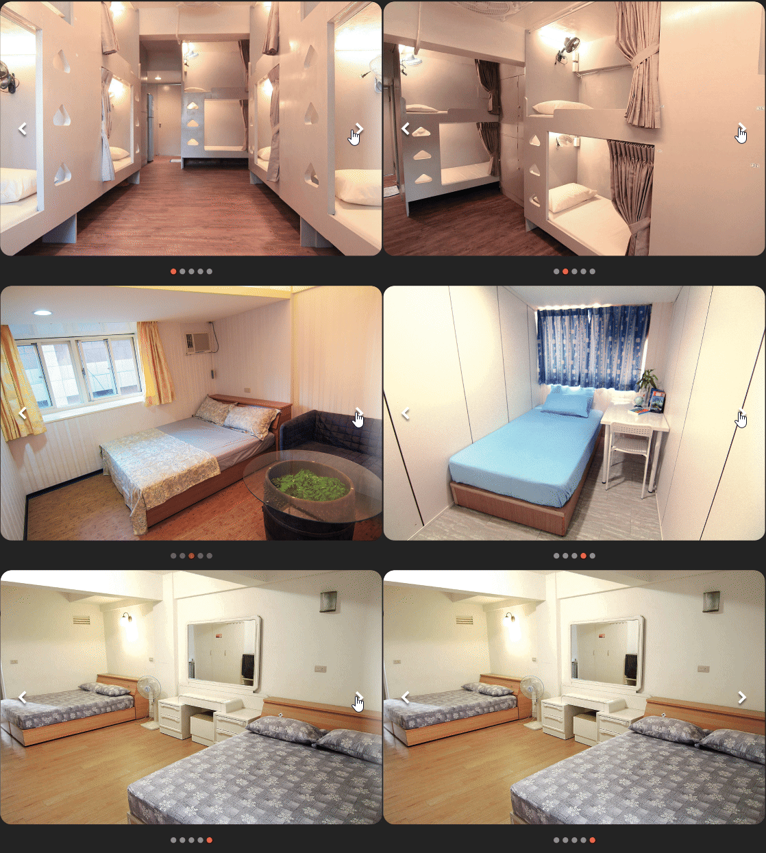
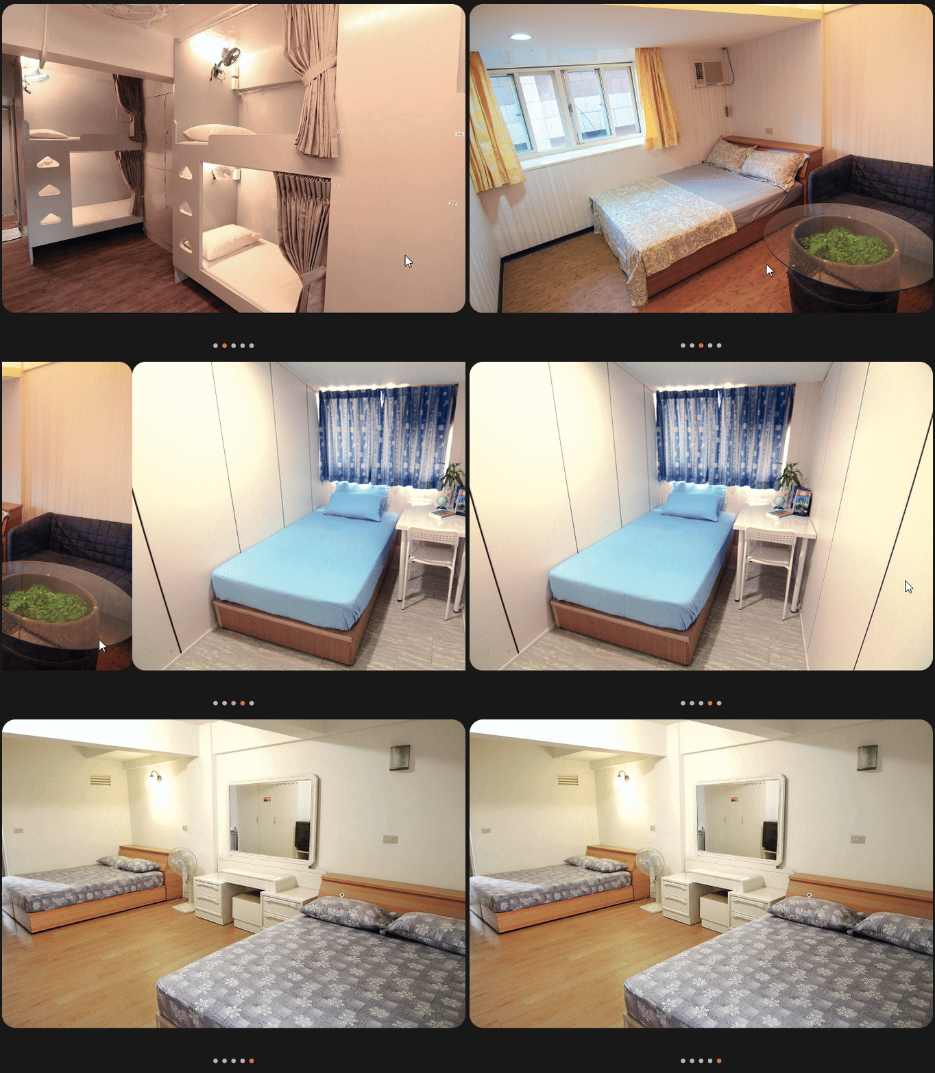
Intuitive Usability: It is more intuitive to view photos in the carousel gallery by clicking right or left to navigate through photos rather than dragging on the desktop version.
Prototyping: Ensure all photo expansions in Instagram feed are linked.
USABILITY TEST SUMMARY
What Worked
Clear Navigation: Respondents found the layout logical and appropriately arranged.
Transparency: There was sufficient information on the site to proceed with booking.
User Satisfaction: The booking feature was seamlessly easy to use, without any friction.
Trust: The information provided on the site helped establish trust and credibility in the business.
ITERATIONS
INTUITIVE USABILITY
During usability testing, I discovered that users preferred clicking through photo galleries over dragging carousel galleries on desktops. Conversely, swiping was more intuitive on mobile devices. As a result, I redesigned the interface to allow both desktop and mobile users the option to click left and right to navigate photos, in addition to swiping or dragging through the carousel.
BEFORE

AFTER


Given Taiwan's popularity among global travelers, implementing multiple language options would enhance accessibility for users worldwide. Additionally, integrating a currency conversion feature could further streamline the booking process for international visitors.
FUTURE ROADMAPPING
There are several features that could be added alongside the crowd density heatmap for future roadmapping. Here are some ideas that stood out to me:

A primary objective of this project was to build trust and demonstrate value for the business. Based on insights gathered from user interviews, incorporating maps, clear directions to the location, highlighting popular attractions, and offering recommendations to site visitors would strongly support achieving these goals.

Ultimately, the decision rests with the business owner, but my interviews revealed that users place significant importance on promotions, discounts, and freebies when making purchasing decisions. Small gestures such as offering daily complimentary coffee or coupons for local businesses can make a positive impact.
REFLECTION
Working on this project taught me many valuable lessons. The ones that really stood out were:
Interaction Design
When designing for multiple devices, it's crucial not only to resize elements and prioritize information, but also to consider how users expect to interact with these elements. Testing both mobile and desktop versions highlighted that users already have established mental models for interacting with certain elements. These models have evolved through generations of usability testing and should be taken into account during the design process.
Trust
Branding encompasses how a company portrays itself to the world through its visual identity, values, and reputation. While creating an aesthetically pleasing and user-friendly website can benefit a business, these efforts may not yield significant results without a solid reputation. Thus, establishing trust and credibility is crucial for businesses operating in competitive environments.
Constraints
While exploring different effects in Figma, I found them captivating and visually appealing. Yet, I came to recognize the significance of exercising restraint and upholding simplicity for an ideal user experience. Hence, I consciously opted to reduce the usage of effects, in line with my fundamental values of simplicity and accessibility.


